So, the market has been going crazy after the election and people keep talking about how ‘overbought’ the market is. Well, the market certainly has gone up a lot in a short time. But is this important or relevant?
Back in my technical days when I was doing a lot of research on technical indicators, the irony was that when a short term oscillator like the RSI or MACD was in ‘overbought’ region where most books tell you that the market is overbought and therefore must be sold, the markets tended to do even better. Of course, over time, all of this nets out to a random result as buying overbought markets made you tons of money in trending markets and vice versa. The key was trying to figure out whether the market will be range-bound or trending in the future. Without knowing that, the indicators were basically useless.
But anyway, the overvaluation, rising interest rates and short-term overbought-ness of the market got me thinking about what really matters in calling major turns. People have been calling for a bear market since the crisis and they’ve been wrong. The stock market has been called a bubble too. Maybe it’s a bubble. In any case, people have been saying the market is overbought for a long time, even when the market just rallied back to where it was pre-crisis. Is something that goes from $100 to $50, and then back to $100 really overbought? Or is it just flat?
Predictions
And by the way, I just want to reiterate how useless predictions are. I remember on a Markel conference call Thomas Gaynor pointed out how oil prices went from $100 to $50 in just a few months, proving that “nobody knows anything” or some such.
This year has again really reinforced this idea. First it was Brexit, and then it was the U.S. election. People were wrong about Brexit (UK voted ‘out’) and then the markets rallied hard after an initial dip. The same thing happened with the U.S. election.
People say that the market is getting overly optimistic and is likely discounting more than Trump can actually deliver. This is probably true to some extent.
But my feeling is not so much that Trump is going to get the economy going strong; it’s that the heavy cloud hanging over the economy and banks has sort of been lifted. Elizabeth Warren will probably have less influence, and the cabinet seems to be filling up with billionaires including Goldman Sachs people and Jamie Dimon too, to head the Business Roundtable.
Long-Term Overbought
Anyway, for long term investors, we don’t care if the market is short-term overbought or oversold. We’ll leave that to the daytraders. Short-term overbought means nothing, usually. It either means the market will take a break, correct, or will keep going up. Useful, right?
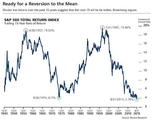
But seriously, if you want to look at overbought oscillators, there is one that is sort of interesting. There was a chart in Barron’s last year that was interesting to me. It was in an interview with Joe Rosenberg, the chief investment strategist at Loews. He was calling for higher returns in U.S. stocks over the next 15 years. This was in contrast to most long term bearish views at the time (and even now).
Check it out.
I admit that when I saw this, I scratched my head a little. The chart looks like it should revert back to 10-12%, implying 10-12% trailing total returns over 15 years at some point in the future. That is not the sort of equity market return that I would expect over time. Of course, this may happen 15 years after the 2008/2009 low; this would give that 15-year return a little bump due to the low starting point.
But never mind that, the more important point for me was that despite what people were saying, that the market is overvalued, that the market is overbought (looking at the S&P return since the crisis low) and all that, I just wasn’t feeling like the market was in a bubble ready to collapse.
I’ve seen some bubbles, and one of the key indicators in my mind of a real bubble is not only valuations, but trailing returns. When you see the Nikkei 225 in 1989, U.S. market in 1929 and 1999 and the recent gold bull market, they all had spectacular 1,3, 5 and 10 year (and maybe more time period) returns. This sort of high return pattern over many time spans reinforces the bull story and gets everybody participating.
To me, that sort of thing sets up the bubble; people chase returns, everybody jumps on board, that makes the market go up more, improving trailing returns in a self-reinforcing, virtuous circle of ever-rising stock prices.
This is not something that we see now. I haven’t seen it at all in the rally since the crisis low either. It’s been more of a grudging rally with doubts and deniers all along.
Updated Chart
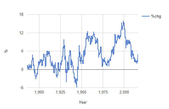
So naturally, I updated the above chart to include the S&P 500 rally after the election through now (the Novemeber S&P figure is 2240).
If you notice the previous peaks, we are far away from that. We are in no way set up for a 1929 or 1999-type top in the stock market.
Of course, as usual, this doesn’t mean that we can’t go into a bear market. We can enter a bear market at any time for any reason. And the only people who are going to call it correctly are going to be the people who have been calling for one for years or decades (and those broken clocks will be right then).
Putting this together with my other post about interest rates, there doesn’t seem to be a threat of an imminent, 1929/1999/Nikkei 1989-like top in the stock market. Sure, it can happen, but to me, the setup just isn’t there.
Brooklyn Investor Website
Anyway, you can see this chart on an interactive basis (you can click to see values, even though I don’t know why I can’t see the latest datapoints; I am still experimenting with various charting libraries; this one uses Google Charts) at the new and still under-construction-so-not-so-interesting Brooklyn Investor website.
The chart is here: S&P 500 15-year Change
The website is here: http://brklninvestor.com/
Obviously, the more obvious, preferable domain names were already taken so I just took out the ‘oo’s from Brooklyn.
Anyway, I will be adding stuff there over time. Maybe charts and tables that I like to keep up to date and track and some ‘notes’ about certain topics that I might want over there instead of here where it can get buried under hundreds of other blog posts.
Keep in mind that it is sort of a coding experiment on my part too, so there will be problems that I will try to resolve over time. For example, the 13F tool stinks… I have to work on that. Probably not too hard, but just a matter of spending time to fix it.


I gave it a quick glance. Looks nice to me. The navigation changes (contact is missing) when I go to about but besides it looks really nice.
Re higher return over the next 15 years: does this mean there will be a point in time over the next 15 years where you can lock in higher returns (as a buy-and-hold investor) than today? I guess that is a pretty safe bet if you believe in mean reversion (something that value investors typically do)…
Hi, thanks. I deliberately leave out some buttons on the more minor pages; this way when I add buttons, I have fewer pages to update. Not all the pages need all the buttons. As long as the nav bar is on the home page, and all the other pages have a link to the home page, it should be fine… this is not a commercial website so I can take shortcuts like that, lol…
As for the the 15 year chart, I don't know. I only looked at is as a bubble indicator. The biggest, most spectacular bubbles always have great long term returns (confirmation of whatever thesis is popular at the time).
Keep in mind that if the market just goes up 2-3%/ year for another 8 years, that would make the 15 year annualized price change 10% because it would be cycling off the 2009 low at 666 (don't know if I did the math right).
So just because the above chart gets back to 10-12% range doesn't mean you are going to earn 10-12% on stocks over time.
For me, this is just a bubble indicator.
I deliberately leave out some buttons on the more minor pages; this way when I add buttons, I have fewer pages to update.
Understood. I am probably rather anal when it comes to things like this…
So just because the above chart gets back to 10-12% range doesn't mean you are going to earn 10-12% on stocks over time.
True, because you don't know the terminal PE (you can only assume that PEs return to their long-term average). But I would say you have a fair chance to get a "decent" return, not what you would get if you invest today (figures may vary, but very low single digits is probably a good guess).
Thank you so much for all of your efforts. I have enjoyed reading your blog for many years and appreciate both your return to posting your comments (after a dormant period) and now with the addition of the new site. I look forward to reading your thoughts in both places in the coming year. Thank you again!
Outstanding post. i saw the article in Barron's last year. Appreciate the update
Hi, kk,
Thanks, I really enjoy your site. Two things that I can't help but think when I review the post above are: 1) isn't a 15 year return period arbitrary? what about a 10 year horizon? Or if we choose a 7 year horizon, today we are well above the average trailing return compared to the previous 15 years' trailing periods 2) why would future returns be predicated in any way on our trailing returns? Just as an individual stock does not care what your return has been, a market return does not "owe" us anything, including a satisfactory return–it is, rather the performance of businesses that determines the market return in the long run, obviously, so an expectation of a reversion to the long term mean of business' earnings would seem to be a better indicator of a "coiled spring" effect than selecting a trailing market return period. Could you comment on this idea?
Thanks again for all of your posts, I do enjoy hearing the way you think.
Ian you are correct using a 10 or 20 year horizon produces a VERY different chart — both show quite average long run returns. So the 15 was a bit of data engineering.
Good point that 10 and 20 year look different. Having my own website already is paying dividends as I can put up stuff when I can't cut and paste. Here's the 10/15 and 20 year charts. I didn't bother labeling it as it's obvious:
http://brklninvestor.com/sp_10_15_20.html
I don't know why a 15 year chart was used initially, but maybe it looks better. I only updated it without much thought.
Why would trailing returns have anything to do with future returns? For me, I get worried when *everything* lines up too much, especially returns across various time frames. So to me, the fact that the 10 and 20 year charts look different is not relevant at all since those don't show the 1929/1999-type excess either. That's what I am worried most about.
And in that sense, the 10 and 20 year charts also were issuing warnings back in 1929/1999, so as far as my usage of these charts (bubble-indicator), it doesn't really matter which one I use.
And before I looked at the updated chart, I knew that none of the longer term charts are going to look like 29/99 anyway as the market hasn't done much since 1999/2000.
I didn't look at the 15 year chart last year at the low end of the range and think necessarily that stocks must go up. It just made me feel like there was probably not a lot of speculative buildup in the market (so therefore not much fuel for a crash; even though the market tanked in 1974/75 after having been flat since 1964/65, so it's not a sure thing).
Anyway, thanks for the questions and comments.
This is just a curiosity for me; I don't do anything based on any of this stuff, of course…
I don't know why a 15 year chart was used initially, but maybe it looks better.
You need a sufficiently long time horizon so that the noise cancels out. Whether you use 10, 12 or 15 years if probably a matter of taste. Hussman uses 12 years because he claims that the auto-correlation of returns drops to 0 after 12 years. Graham's choice of 10 years was probably as arbitrary.
I saw a quote somewhere along the lines that we can't be in bubble bull market because there's still too many bears saying that we are in a bubble bull market.
The new website is very interesting congratulations on all your work !!!
If I can make a suggestion I would add on the 13F Portfolios the ticker name since there are names that look the same but have different ticker symbols for example Liberty Media (tickers LMCA, LMCK).
Anyway all your columns are very good,
Once again thanks for writing and sharing your knowledge with us,
Hugo
why don't you use free available tools like dataroma.com that do the 13-F work for you ?
incl. all the statistical analysis quarter by quarter etc…
Hi, I do use Dataroma; it's great! But I wrote my own 13-F script to look at funds/investors that aren't listed there. Plus coding is my hobby these days and felt like an interesting project to try. Thanks for dropping by.
Related empirical question I'm very curious about: for as long as TIPS have existed (since 1997), has there ever been a period where interest rates increased significantly but TIPS spreads did not?
Hi,
Sorry for the late response. I haven't done any work in that area so have no idea…
I really liked the 15 year S&P return chart and your evaluation of with regards to bubbles. Inspired by this article I grabbed a copy of Robert Schiller's S&P 500 data and built a similar chart. The numbers don't quite line up, but that may be due to time granularity.
See: https://public.tableau.com/profile/jeffrey.albro
-Jeff