Another post! Don’t assume this is going to be the normal frequency going forward. I think my previous pace of 1-4 posts a month is the best you should expect. Anyway, I came across (again) a scary looking chart, and I hear people screaming to sell everything now, so I thought I’d revisit the issue of the whole market again. This may be new to people who are new here so there is that too.
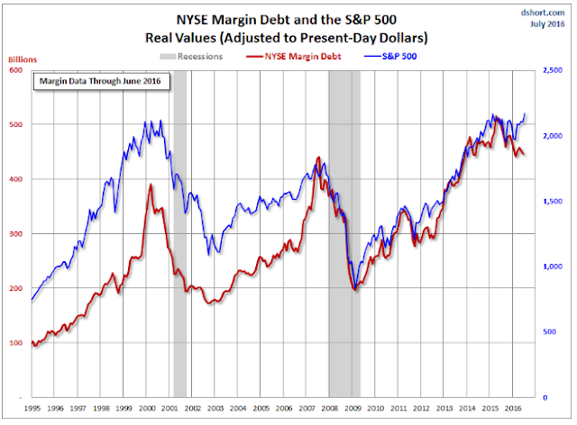
Anyway, check out this chart below. Here is the full article:
Advisor Perspectives article on NYSE margin debt
Digression
Oh, and by the way, I noticed that Sequoia initiated a position in Chipotle (CMG). I still really like CMG, but I also agree that it is not a cheap stock at all. I did buy some due to this ‘crisis’, though, even though it didn’t get cheap by the usual measures.
Anyway, I think they did get a raw deal last year. CMG tried to explain that every time the CDC came out with announcements, that they were not new cases of food poisoning, but just announcements of old ones that already happened. They all happened early on, clustered during a certain period. But the annoucements of each case dragged out a little at a time, so what it looked like was that CMG had a food poisoning case and then they announce measures to fix it, and then another announcement comes that happened BEFORE the fixes were put in place. But the public thinks it happened AFTER measures were taken to prevent it.
So things looked really out of control. People were like, holy cow, they can’t stop it!
But that was never the case. I think they will be back even if it takes a little more time (due to the above, unfortunate thing).
Oh, and by the way, the chorizo burrito is amazing!
Back to Topic
To be fair, the author doesn’t claim that this is an indicator of any sort. But I’ve seen/heard others warn about this as an indicator of a coming crash.
Yeah, it’s scary alright. In the full article, there are various variations of this chart. But I was curious why they didn’t put up the one that seems to me the most important. When I saw this chart, my first reaction was, well, gee, it’s a coincident indicator. Of course margin debt goes up when the market goes up and vice versa. That’s sort of natural and you would expect that. The question is, as far as I’m concerned, how much is margin debt expanding relative to market cap? Back in the late 1990’s, one of the tells was that this margin debt expanded suddenly and exponentially.
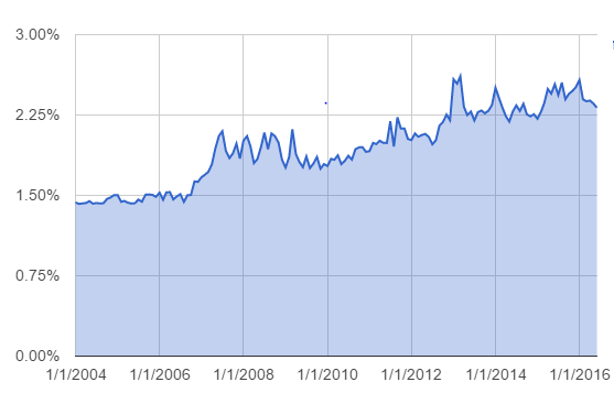
How is it looking these days? You can google “margin debt as percent of market cap” to get long term charts of this. I recreated it with data from NYSE, but the data didn’t go back too far. Maybe there is fuller data somewhere, but for now, I just found stuff back to 2004.
Check it out:
Anyway, margin debt went above 2.00% of market cap back in 2013. I think that was the marker of a bubble in the past, and the market is up 50% since then. Of course, this doesn’t mean that a bubble doesn’t exist. It is possible that the speculative frenzy goes further and lasts longer than people imagine and then implodes.
But if you compare it to the 2000 spike, it isn’t similar at all. It doesn’t feel like a speculative, blow-off spike in margin debt. Back in 2000, margin debt blew up from 1.3% or so to 2.6%, basically doubling. After the bubble popped, it came all the way back down to pre-bubble levels of around 1.3% (I’m eyeballing this on a long term chart so may be a little off).
Recently, it crept up from 1.8% at the crisis low up to close to 2.6% in January of this year. It’s been slow and gradual. Debt is debt, though, so maybe this is not a mitigating factor.
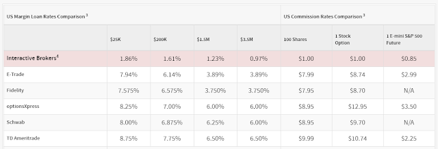
Not to be too bullish, but there are many reasons why margin debt is higher these days than in the past. Note how margin debt didn’t go down that much even during the financial crisis. That was when a lot of speculative excess was blown out. There seems to be a lot of discussion about this here and there, but one major reason of an uptrending margin debt is that margin rates are a lot lower now than in the past due to competitors like Interactive Brokers who offer rates less than 1%. Typically, margin rates are more in the 6-8% range regardless how low interest rates get.
In this environment, you can imagine a lot of carry trades going on; investors buying high yield stocks, MLP’s (OK, maybe not so much now), REITs on margin.
Of course, that is not so comforting either. When carry trades go too far (when too many people try to cross the same bridge at the same time), it can blow up.
But it’s not the same as the late 1990’s when people just bought stock splits and dot-coms on margin (I remember almost everyone seemed to have stock split announcements sent to their beepers at the time so they can enter buy orders on those names).
So even if it may not necessarily be good news, I think some of this margin debt simply reflects the divergence in dividend yields and interest rates; and for the first time in history it seems like individual investors can play the carry game with competitive cost of carry.
Other Scary Charts
The other scary thing these days that people keep talking about are valuation levels. We are at historically high levels. CAPE ratio is very high etc.
And the bears say, the bulls use interest rates as an excuse for the high valuation. They say that when interest rates finally start to go up, the stock market will take a hit. This is true.
But let’s take a look at some charts to see if there is any validity to the bulls (or, let’s say, not-so-bearish arguments).
First of all, there are bears that argue that the Fed model (comparing stock market earnings yield to the 10-year bond yield) is flawed, and that it only worked for a short period of time in the past. This is also true and I sort of validated that in a previous post that I will go back to in a second.
But having said that, we still can’t separate stock market valuation from interest rates. To use the time-honored tradition of hiding behind a higher authority to make a case, here is Warren Buffett himself tying the valuation of the stock market to interest rates, and long before the so-called Fed model showed any real correlation. Read it here:
When interest rates are low, asset prices are high for obvious reasons. This is simple economics and I can’t really convince anyone who doesn’t agree with that.
The argument, I suppose, is that interest rates are at unsustainably low levels due to the central bank money-printing around the world (and therefore stock market valuations are unsustainably high).
There is some truth to that too. I won’t argue with that.
So, since we looked at and talked about some popular ‘scary’ charts going around, let’s look at some other charts that I like to look at that doesn’t get passed around all that much, I suppose, due to the lack of dramatic effect; they are not scary!
Bond Yield versus Earnings Yield
First of all, if you are new here or you don’t remember, skim this past post. I scatter-plotted bond yields versus earnings yield going back to 1871.
Here is the post: Scatter Plot
The data goes back decades so I didn’t update it. Adding 2015 to it won’t make a big difference either way.
As you can see, there is a relationship between bond yields and earnings yield. The longer the history, the less the correlation. But that may be due to many things. Accounting rules, interest rate regulations etc. Not to mention how stocks are valued in general; remember, in the old days stocks were considered speculative and it was unthinkable to buy a stock that yielded less than government bond yields. But this was not true for most of the second half of the last century.
In any case, I too believe that interest rates are probably at unsustainably low levels, even though I still lean more towards “lower for longer”, following the Japan model (but better).
So let’s assume that interest rates will go UP, and then let’s see how overvalued the market would be in that case.
My simple analysis is that long term interest rates should be around where nominal GDP growth is. See the above scatter-plot post for why I think so.
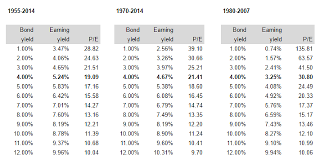
Let’s say we get to what the Fed wants; 2% real growth and 2% real inflation. That would give us a 10-year rate of 4.0%.
Here is a cut-and-paste from the scatter post:
When interest rates were between 4% and 6% since 1955, the stock market traded at an average P/E of 20.4x. If you put standard deviation bands around the cluster, the range would be 16.6x – 26.6x for one standard deviation and 14x – 37.9x for two standard deviations.
If you expand the range to 4-7% or 4-8%, then the average P/E comes down to 14x, so in that case the market would look overvalued. But I think a lot of the vertical dot cluster in the 7-8% range is from the 1970’s. Of course, we can’t assume that won’t happen again.
Just for fun, let’s see these figures from 1980-2014. Some will argue that this is no good since the market has been overvalued for most of the past three decades. But again, let’s just see for fun.
Interest rate range average P/E
4 – 6% 23.3x
4 – 7% 22.7x
4 – 8% 21.6x
If you do it by constant range (instead of expanding it) you get:
Interest rate range average P/E
4 – 6% 23.3x
6 – 8% 19.6x
Using data since 1980, even if rates went up to the range of 6-8%, the market would be fairly valued at 19.6x P/E.
Yes, we can argue back and forth all day about whether we should use the data from 1871 to now, since 1955, since 1970 or since 1980.
I tend to favor excluding data from before 1950 for the usual reasons. I know not everyone will agree with this, but that’s OK. I am not trying to predict the market or convince anyone of anything. I am just looking at the facts and going, hmmm…. that’s very interesting…
The point of the above is that even if interest rates go up A LOT, (10-year rates are now 1.5%, so even if rates more than double), the market is not overvalued.
Regression Lines
I don’t remember why I didn’t tabulate the regression lines in the scatter post, but here it is. The 1980-2007 line has a really nice fit with an R-squared of 0.77. And yes, critics will argue that is overfitted as I am excluding periods that are inconvenient.
But it’s not unreasonable to say that the 1970’s was an aberration and the crisis too was one (period after 2007). The regression fit nicely for 27 years, so that’s not insignificant.
In any case, yes, it’s kind of ‘convenient’ and maybe overstates the case to some extent. But even if you look at the regression for the periods 1955-2015 and 1970-2015, they show that at an interest rate of 4.0% (more than double current level!), the market would be fairly valued at 19-21x P/E.
If rates continue to go down, I would NOT chase the market up and use lower interest rates to get fair value of the stock market. So I tend not to agree with people who say that the market is really undervalued with interest rates where they are. The market is only really cheap if you think interest rates will stay at 1.5% for a really long time.
Conclusion
So there it is. Some other charts that are not so dramatic and scary. Interest rates can go up a LOT and not really impact the fair value of the market. This is not to say that there won’t be short term blips. If rates go up, stocks will probably go down. But the point is that they don’t necessarily have to move down a lot to correct valuation levels unless interest rates go up a lot more than 4-5%.
And, this is not to say that there won’t be bear markets. Markets will go up and down regardless of all of this stuff, so this is not a prediction. It’s just a point of reference to see if there is any rubber band being stretched in any way that has to snap back violently.
(A short term chart like the above showed a serious deviation right before Black Monday).
If abnormally low interest rates are the reason you think the stock market is overvalued, then shorting bonds seems to be a much better idea than shorting stocks.
Added comment: By the way, the bears keep saying that the bulls think this time is different. Hmmm… The above charts sort of show that, no, at least in my case, I am claiming that this time is not different at all, and the market is trading right around where you would expect it to be trading at, even if rates get up to 4-6%. Indeed, this time is not different.
Anyway, get yourself a Chiptopia card, try the chorizo burrito and enjoy these charts!


Excellent post. Always welcome to read some common sense as opposed to the maniacal cries of bubble, depression and doom.
Hi, i think u forgot to insert the URL into the advisor perspectives article.
Believe it's this one.
http://www.advisorperspectives.com/dshort/updates/NYSE-Margin-Debt-and-the-SPX.php
Thanks. I fixed it.
Great post and interesting point regarding margin debt.
However I dont like when both margin debt, number of IPOs and buybacks signal a bubble at the same time. I also find margin debt adjusted for inflation as more informative than as precentage of market cap, but thats just my opinion. M&A activity is also up quite a bit from what i know.
What the CAPE tries to do is to adjust for the variability of profit margins, I would therefore suggest caution when valuing the market based on current p/e ratios.
Fortunately here in Sweden valuations are not as a extreme, although stock market interest seem to be too high. Recently WE had a boom in IPO issuance almost matching the mania during 2000. The lower stock market valuation in Sweden is also a result of Riksbanken suppressing the value of the SEK, lifting the profits of exporting companies.
Here comes some more "scary charts", ENJOY:
http://jessefelder.tumblr.com/post/148107159765/over-the-past-50-years-an-earnings-recession-of
https://twitter.com/markets/status/756453387089113088?ref_src=twsrc%5Etfw
https://www.thefelderreport.com/2016/01/27/what-follows-the-most-epic-reach-for-yield-episode-in-history/
Finally you got Druckenmillers presentation which can be seen here:
http://jordholmen.blogspot.se/2016/05/en-av-var-tids-framsta-placerare-ar.html
Frank K Martins text is also interesting, which discusses the CAPE ratio:
https://www.mcmadvisors.com/wp-content/uploads/2015/02/Why-We-Worry-Top-Down_.pdf
#DifferentThisTime, #RetardedComment #ReadingAllLinksTakes3Days.
Have a nice day
"Gloom and doom" from Sweden.
Thanks for all the great stuff. I am familiar with most of it and Druckenmiller's argument. I love reading things like that.
But you know, as usual, I've been reading stuff like that for decades and it's always fun to read. But I don't know what to do with it, really.
I try as hard as I can to think of myself as a businessman accumulating businesses, so most of those things don't have anything to do with that. Yes, maybe GDP is lower from now on due to demographics, debt levels and whatnot. But if I own a great business with decent margins and returns on capital at a decent price, I'm fine.
I'm sitting here at a big mall now (family thing, cousins, nephews etc…). If you own a crowded restaurant, you are not going to sell because Druckenmiller says we are screwed, right? So that's how I try to look at it.
I always argued that the stock market has what I would call the "curse of liquidity". It's so easy to hit the "sell" button on a stock so it's hard to own stuff over time. It really is. Believe me, I am tempted as much as anyone else to dump everything and go into triple leverage inverse S&P ETF's after reading some of this stuff.
My views here are really not anything to do with whether we will have a bear market or not. I am sure we will have 20% and even 50% corrections over time, and I believe they will happen. That's 100% certain. But I also believe it will tend to happen when people don't expect it; not when the main 'stars' are "ringing the bell" on CNBC every other day.
Those charts in the above are all quite scary and we should all be mindful of it, but also keep in mind that a lot of it is double-counting.
If asset prices are high due to low interest rates, then everything else is going to look high too. Of course, wealth as percent of GDP or whatever will be high, cuz asset values are high, because interest rates are low. Stock market to GDP is also high cuz rates are low etc.
So they are all pointing to the same thing. Sometimes, it feels like modelers try to count each one as separate evidence of a bubble, but to me, it's still just one data point, not 3 or 5. It's still just one. High asset/wealth level to GDP also just means return on asset is low. But with interest rates at 1.5%, of course that will be true.
So, no need, really, to freak out over each chart that looks like that because they are all the same.
Anyway, again, this is not to say we won't have a big correction. We will, no doubt.
Maybe I will make another post about this in the near future after reading all the above info carefully. Thanks for posting all the links!
Great article as usual. Wondering if you might be interesting on writing a CMG stock valuation.. Cheers!
Hi, maybe I will at some point, but CMG is pretty straight forward. I don't think there is anything on the balance sheet or income statement that is 'hidden' or anything like that. It just comes down to how much more they can grow, if they can get back and then maintain some good sss growth, margins back up etc. I wouldn't want to price in the other concepts yet as it's probably true that most attempts with chains starting other concepts tend not to work out. I hope, more as a customer than a shareholder, that the Asian Shophouse works out. I loved the one in DC and can't wait til they roll it out in NYC.
Thanks for dropping by…
hi kk
agree with you on not chasing the equity market up based on lower rates. Aside from rates not staying low forever, the logic of lower rate = higher equity valuation only works to a certain point
If rate goes to say 1%, people are probably going to say "based on some formula, required return on equity should be 6-8%". But if they think about what they're discounting, these forecasted cash flows/earnings for stocks could easily be off by 10-30%! So discounting that by 6% would provide no margin of safety whatsoever. There has to be a floor for equity discount rates to cover the forecast/modeling risk that is missing in treausry/IG bonds
Unfortunately this flawed logic of low rate = low discount rate seems to be taking hold, and I wouldnt be surprised if market is headed for a ridiculous bubble from here..
Logically, stocks shouldn't be valued relative to current rates, but rather relative to the expected discounted return from rates across the duration of the investment. Or at least that's what makes sense to me.
This is why stocks don't double when rates go down by half, since they're expected to climb back up again. However, if it were somehow known that rates would *permanently* stay as low as they currently are then stocks would logically be priced much much higher than their current valuations.
interesting stuff thanks